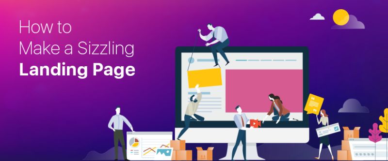
How to Make a Sizzling Landing Page
By: Vanessa Anderson Posted on Wed, 18-03-2020
Marketing strategies are as fast as furious, like a cheetah, running around to chase a gazelle. Business is the cheetah in this case scenario, wanting to attract the customer or a client with the best landing page gig.
You need to be able to attract customers in a way that says "you've got it all" but how will you do it? Thanks to the landing pages, with the right pitch and siren tone, make sure your client or consumer is unable to resist your offer.
Query: What is a Landing Page?
Imagine a high-quality digital marketing advertising dedicated to your website. This sort of advertising forum is considered a creative stimulus for your consumer. Once a visitor sees the ad, they click on it and then they are led to the desired landing page (the page of focus).
Therefore, a marketing strategy can be summarized under three main categories
- The market
- The ad
- The landing page
So it suffices to say, it is one of the most important pages of your website. It will not only attract the customer but also retain it. This covers a complicated set of designing and other elements including; pictures, the copy, the structure, etc. which is quite time taking on its own.
Answer: Take One Step at a Time
Some tools support the landing pages, so you do not have to build it from scratch. But it still is hectic and time taking to design a landing page. You can create a landing page with a proper guideline to create a story that will become your unique selling point of the required campaign.
So to build up a landing page you do not only need luck but a bust of ideas, art, and creative tools.
1. The Header
The eyes and ears of a landing page is the header. It comes in various sizes and shapes but has three main body parts without which it cannot function; the logo, copy and call to action button (CTA). Some qualitative factors need to be similar to your website to show a strong affiliation to the page such as color schemes, font style/size, the use of the logo and then you add the CTA.
Before you engage the visitor towards CTA, your need to ensure that a customer has an understanding of Why they need to click on that bull's eye button. The reason must be compelling enough to get the click.
2. The Hero Image
As you might be impressed by the visuals and graphic stunts in Marvel movies, the fighting sequences are pretty amazing. One cannot deny the fact of how real it looks and the oohs and aahs moments are the best ones. As a hero saves the day, likewise a hero shot saves the landing page. An image that represents the idea, quality, and efficiency all embossed in one image.
While a flashy cape may not be your ideal approach to attract a visitor, but a hero image is what will make your ad stand out. Banners, the main images in the headers are usually large and upstream with focus. Perhaps the first thing that a user notices is the image, so use a high quality defined image that will serve the purpose of the product or service. One thing to ensure is that the image should take away all the attention from the CTA.
3. Call to Action is a Savior
A highly compelling or catchy phrase is like an elixir for a marketing campaign. Especially for a landing page, you need to boost the conversion rates, with a prominent call to action button. One common mistake on a loop is the repetition of words, you need to avoid it. Rather take a stance and make extraordinary out of the ordinary picture.
A call to action button should be able to present your niche audience and must be compelling enough to engage the user like;
- Get my quote
- Schedule for consultation
- Contact right away
- Open for proposals
- Let’s talk etc.
A call to action needs to be clear and precise conveying the message to the visitor. Consider it as the marketing summary for the ad.
4. Creative Copy
How are you going to tell your story? The big W is here and perhaps a vital part of the marketing mix as well. Despite the importance of the call to action, you need to grasp the attention of the user with a stunning story or creative idea (as a content) so they get engaged with the ad in the first place.
The copy adds the charm and beguiles the user to visit the landing page and to the main website. Creative copies in itself are a self-promotional tool that highlights the brand in quality of words. For instance, you can use testimonials of your clients as a creative copy to engage a user with prior experience of the clients.
Besides that, what about a lightbox pop-pup? This gives you many options to explore the copy and provides you more space to create more content although you are on the same page.
5. Any Perfect Footer?
It's hard to imagine a footer that is ideal but can be close to perfection. A footer has two major purposes; a strong call to action button and social proof. Social media icons are present there (LinkedIn, Instagram, Facebook, etc.) that shows your social interactions from business to customer and how much of a strong impact you have on the landing audience.
The main purpose of a landing page is to maximize the conversion rate. It can be a strong selling point of a landing page that is often ignored or not enough effort into. It’s good to analyze your landing pages and make the necessary insightful changes but you need to be well aware of the audience requirements so that you can make a change accordingly.
Conclusion
With the right quality input, you can experience an advance conversion rate. A landing page is a gig you need to acquire the attention of clients or online users in the fastest way possible. You can put your best effort in it, although no campaign is ever perfect, you still need to conduct test and trial methods to find the perfect landing story for the website.

Africa is the second largest and second most populous continent. As recent statistics suggest, 1,486,275,887 is the current population of
Read more
No state on the western side of the globe can compare the strategic geographic location, diverse multilingual workforce, and attention
Read more
San Diego is California's second-largest city, and it has a population of 1.3 million from which three million residents are
Read more
Dallas is the largest state in Texas after Houston and San Antonio. It is the ninth most populous city in
Read more
In this day and age, users love to consume video content. Statistics show that almost 90% of all internet users
Read more
Virtual reality is transforming our imaginative worlds into existence. Since childhood, we used to create visionary kingdoms and act like
Read more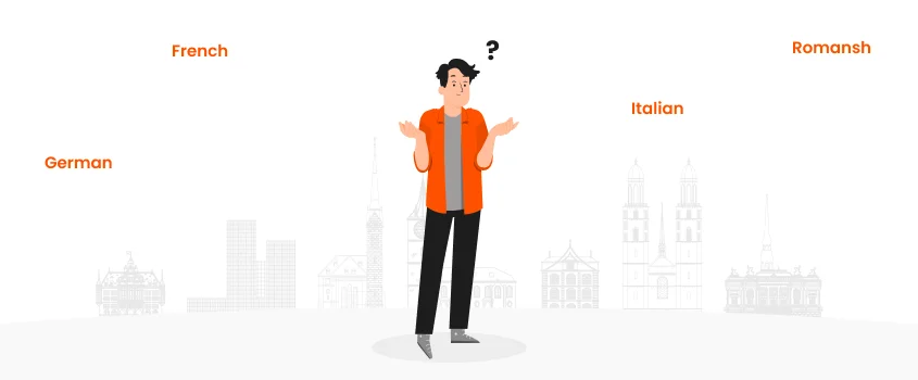
Switzerland is a landlocked country with a very interesting history. The culture and languages spoken in Switzerland are highly influenced
Read more
Digitalization has played a great role in this global world. People seek the internet to find the solution to everything.
Read more
Creating massive amounts of content, buying ads, and keeping the social media game up is what most businesses would do
Read more